You may experience challenges when decorating due to a lack of space. It’s not a new feeling to become overwhelmed thinking where you’ll place your things. What most people do not realize is that decorating a small room is actually better – easier to organize, more manageable to maintain, and faster to decorate.
If you’re planning to decorate your apartment, the first thing that you should familiarize yourself with is the reasons why your space looks smaller. Once you know this, it’s easier to find remedies to fix this. Listed below are some of the factors that make your studio apartments in Kansas city feel smaller and the best ways to fix them.
1. Wrong Furniture Placement
One of the primary reasons why your space looks smaller is the amount of furniture you have. Unfortunately, most homeowners overestimate the size and number of pieces their room can handle. The simplest approach here is to have a cleanup. Remove the excess furniture that you have and just retain the basics.
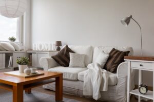
A small apartment might only need two to three chairs, a long couch, a coffee table, a bed, and a cabinet. You may also squeeze in a dresser and nightstand to add some accent.
However, if you’ve already splurged your money and there’s no way that you can let go of what you have, the next remedy is to fix the furniture placement. For a small space, the arrangement is critical.
One cardinal rule is to avoid blocking the entrance, both physically or visually, so it won’t create an illusion of a smaller area. Instead, place that furniture in a corner wall so the room will look bigger. Make sure to leave a gap between the wall and the furniture to perceive a sense of roominess. The same goes with using furniture that has spaces underneath it (between the bottom and the floor). The more the gap is, the more open the area will look.
2. Lack of Mirrors
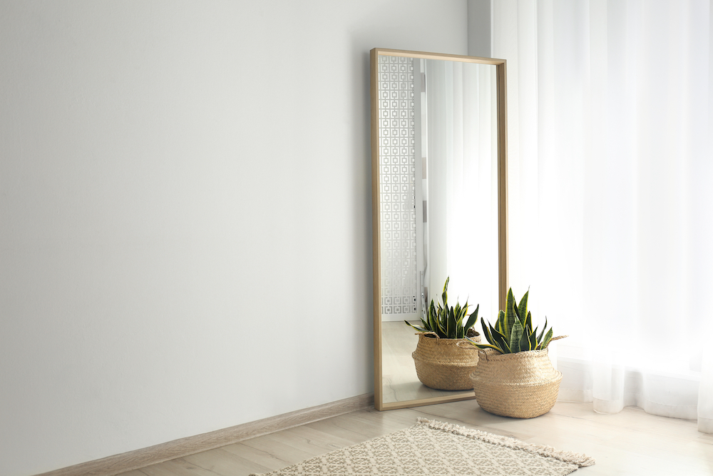
Mirrors are not only there for aesthetics. Aside from its primary function of providing reflection, it can also be another way to craft a larger sense of openness. This is because they have the ability to reflect light and view – tricking the eye into seeing bigger space than reality.
3. Not Using Neutral Color
The darker the wall, the more the room will look smaller. So, unless you’re housing a small movie theater in your small apartment (which is less likely), don’t go for an edgy color. Instead, use a neutral color scheme that will create more openness in this space.
As a starter, the basic schemes are those colors that belong to the same family. You may also go for a delicate warm color or a cool color to project a lighter environment.
If you love dark colors, you may just use these for your room accents.
4. Preferring Small Tiles
Small footprint rooms are challenging to design. Add to this the perception that small tiles bring to the table. Experts revealed that small wall or floor tiles, such as penny tiles, can make the room feel smaller since the visuals look a little bit cluttered compared to using large blocks of tiles.
The first option to address this is to opt for rectangular tiles. Laying these on a horizontal placement will give the room a wider perspective. The most common ones used are the 12-in x 24-in subway wall tiles. Definitely one of the best choices out there!
If you’re not into these rectangular-shaped tiles, you may also give in to using square tiles. However, you just have to make sure that these are large enough so that your room won’t look too cramped. The minimum size for this is 18-in x 18-in.
Don’t forget to pair the light tile with light grout to remove its contrast, and the room will look bigger.
5. Going for Too Plain
Believe it or not, your horizontal and vertical space also adds up to how your apartment looks. The more cluttered the design is, the smaller it will be perceived. Therefore, it is recommended to avoid all of these distracting elements.
We also suggest emphasizing verticals, whether through your furniture, wall designs, and more. Some examples of how to go about it are placing hanging light bulbs, installing vertical shiplap, or adding a tall bookshelf. This move enhances the feeling of both flow and movement, thus, promoting a sense of openness.
You may also go for the horizontals. Adding this layer will spearhead a sense of movement and create more dynamism. This format will also give your eyes the freedom to scout the room. The more your eyes travel, the larger your mind will perceive it.

6. Adding Too Many Plants
Yes, plants are known to help make your space look bigger. However, just like any other issue, too much of something may not be good in the long run. If you’re a plant lover, this might sound disappointing to you. Designers revealed that putting too many plants into your apartment mix may visually close your room and make it look smaller. The darker the area is, the more cramped it will look.
If you really can’t let go of your love of greens, there are other techniques that you can employ so they won’t negatively affect your space. One of which is to choose your plant carefully. Do not store spiky, dying, or droopy plants since this adds to the dark vibes of your room. Make sure to maintain them properly, especially if they are hanging plants. Water them so they won’t hang too low for your room.
Studio apartments in Kansas City may not be the biggest out there, but there are remedies that you can apply to make it look more spacious, even just the illusion of it. Make sure not to make these common design mistakes. Instead, maximize your space through these six tips, and your home will definitely be more comfortable in the long run.

